Building High-Converting WordPress Sales Pages: A Technical Guide

Table of contents
Standard WordPress page templates often fail to convert because they prioritize site-wide navigation over specific visitor goals. Every header menu, sidebar widget, and footer link acts as a potential exit point, pulling the user away from your primary offer. To maximize revenue, you must isolate the sales environment. By stripping away these distractions, you force the visitor to choose between taking the desired action or leaving the page entirely, which clarifies intent and significantly improves conversion metrics.
Building these high-converting pages requires more than just a clean layout; it demands a technical strategy that separates your sales content from your theme’s global styling. Tools like SeedProd allow for this isolation, providing a drag-and-drop interface that functions independently of your primary WordPress theme. This approach ensures that your sales page remains consistent regardless of your site’s broader design updates. Whether you are launching a new digital product or testing a high-stakes landing page, the ability to control every pixel without writing custom code is a major advantage. This guide explores the technical workflow for deploying these pages, from initial configuration and license activation to secure payment integration and final performance testing. By following these steps, you create a focused, high-performance asset that turns traffic into measurable business results while maintaining the flexibility to iterate quickly as your marketing needs evolve over time.
The Strategic Value of Dedicated Sales Pages
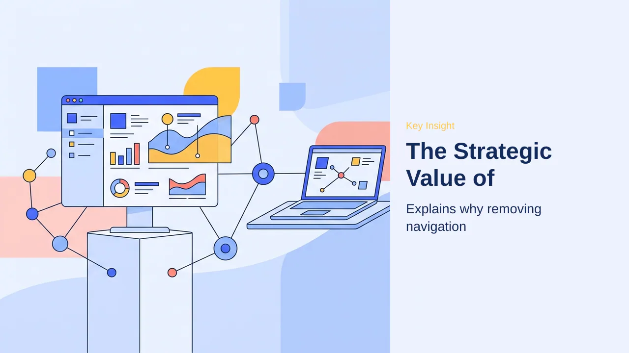
Standard website pages often prioritize browsing, which introduces unnecessary friction during a product launch. Header menus, sidebars, and footer links function as exit points, diverting attention away from the primary offer. Removing header menus and sidebars reduces these exit points, ensuring visitors remain focused on the conversion path.
A dedicated sales page creates a distraction-free environment by isolating the offer from global site elements. This structural change forces a single, clear choice for the user. When navigation noise is eliminated, the cognitive load decreases, allowing the visitor to process the value proposition without interruption. Dedicated pages allow for focused messaging that speaks directly to the user’s specific needs, rather than competing with unrelated content.
This approach is essential for high-intent traffic, such as visitors arriving from email campaigns or paid advertisements. By acting as a conversion anchor, the page maintains consistency from the initial click to the final checkout. Structural isolation provides cleaner data for optimization, as engagement metrics are no longer skewed by traffic wandering to blog archives or secondary pages.
The pricing question is whether the conversion lift from a dedicated, distraction-free page justifies the effort. For most businesses, the answer is yes. The cost of lost sales from a cluttered, high-exit-rate page far outweighs the time investment required to build a focused landing page. By prioritizing a clean, conversion-oriented design, businesses ensure that every visitor has the best possible chance to become a customer.
Consider the following benefits of structural isolation:
- Cleaner Analytics: Engagement metrics reflect specific offer performance without interference from blog or archive traffic.
- Campaign Consistency: Maintains a unified brand message across diverse traffic sources, reducing bounce rates.
- Optimized Pathing: Directs users toward a single, clear call to action, minimizing decision fatigue and cart abandonment.
Note: Dedicated pages prevent visitor drift by removing primary navigation elements, effectively funneling traffic toward the intended conversion goal.
Core Elements of a High-Converting Page
A high-converting sales page relies on a precise arrangement of elements designed to guide the visitor toward a single, decisive action. By stripping away standard site navigation, you create a focused environment where the offer takes center stage. Clear communication of results is the foundation of this strategy, ensuring that visitors understand the value proposition within seconds of arrival.
Crafting Compelling Headlines and Value Propositions
Your headline serves as the primary hook. It must communicate specific results the visitor wants to achieve, avoiding vague or overly clever language. A strong value proposition follows immediately, clarifying who the offer is for and why it matters. If a visitor cannot identify the core benefit within three seconds, the likelihood of them leaving the page increases significantly.
- Focus headlines on tangible outcomes rather than product features.
- Use bold, large typography to ensure the headline commands immediate attention.
- Align the value proposition with the specific pain points of your target audience.
- Avoid jargon that obscures the primary benefit of your offer.
The Role of Social Proof and Testimonials
Social proof builds visitor confidence by demonstrating that others have already achieved success with your product. When potential customers see evidence of real-world results, their hesitation diminishes. Rather than generic praise, prioritize testimonials that highlight specific outcomes or solve common problems, as these carry more weight for prospective buyers.
Beyond written testimonials, consider incorporating elements that provide objective validation. These additions help bridge the gap between interest and commitment:
- Display star ratings to provide quick, visual confirmation of product quality.
- Feature client logos to establish industry credibility and trust.
- Use result-driven quotes that detail the specific value a customer received.
Designing Frictionless Calls to Action
A call to action (CTA) must be unmistakable. When designing your buttons, remove all remaining friction by using direct, action-oriented language such as “Enroll Now” or “Get Instant Access.” Clear, obvious buttons prevent confusion and ensure that the path to purchase remains unobstructed. Every element surrounding the CTA should reinforce the decision to click, keeping the visitor focused on the final conversion step.
Beyond the primary headline, visual hierarchy guides visitor attention. By utilizing whitespace effectively, you prevent cognitive overload, allowing the most important elements—such as your value proposition and call-to-action—to stand out. This deliberate spacing ensures that the visitor’s eye is naturally drawn toward the conversion path rather than being scattered across competing page elements.
Furthermore, maintaining consistency in design across your sales page reinforces brand authority. When your typography, color palette, and imagery align with your broader site identity, visitors feel a sense of continuity that reduces skepticism. This professional presentation is essential for establishing the credibility required to convert cold traffic into long-term customers.
Selecting the Right Page Builder

Building high-converting sales pages requires a tool that balances ease of use with the technical flexibility needed to remove site-wide distractions. SeedProd stands out as the primary solution for WordPress users because it provides a dedicated environment for crafting pages that operate independently of your theme’s standard navigation and sidebars.
Key considerations for Selecting the Right Page Builder
When evaluating page builders for sales-focused tasks, prioritize tools that offer a drag-and-drop editor to facilitate rapid layout iteration. While free versions are suitable for basic testing and familiarizing yourself with the interface, they often lack the specialized components required for high-volume sales environments.
- Drag-and-drop interface for rapid design iteration without coding.
- Access to pre-built sales templates to establish a baseline layout.
- Compatibility with existing payment gateways like WooCommerce or Stripe.
- Ability to isolate the page from theme-level styling conflicts.
- Availability of conversion-focused blocks such as countdown timers and testimonials.
Practical checks for Selecting the Right Page Builder
Before committing to a specific builder, verify that it includes advanced conversion blocks that go beyond basic text and image placement. These elements—including dynamic pricing tables, star ratings, and email opt-in forms—are critical for building trust and guiding visitors toward a single action. Ensure the builder supports a dedicated ‘Isolation Mode’ or similar feature to prevent your site’s header, footer, or sidebar from cluttering the sales experience.
Beyond the core editor, evaluating the long-term maintenance of your page builder is vital. SeedProd avoids vendor lock-in by generating clean, independent layouts that remain stable even when you update your WordPress core or theme files. Furthermore, consider the impact of your builder on site performance; SeedProd is optimized to load only the necessary assets for the specific page being viewed, ensuring that your sales funnel remains fast and responsive. Choosing a well-maintained tool is a strategic investment in the longevity and reliability of your sales infrastructure.
The pricing question is whether the premium feature set justifies the investment for your specific sales volume. While the free version allows for initial layout testing, the premium version is essential for accessing specialized conversion blocks like countdown timers and dynamic pricing tables that directly influence buyer behavior. Upgrading also secures access to dedicated WooCommerce blocks, which streamline the checkout process by allowing customers to initiate payments directly on the sales page. This reduces the number of steps in the funnel, effectively lowering the risk of cart abandonment during the final purchase stage.
Beyond immediate conversion tools, the premium investment provides long-term value through consistent template updates and priority access to new design elements. These updates ensure your sales pages remain compatible with the latest WordPress core releases and security standards. Evaluating the cost against potential revenue gains is a standard practice for scaling operations, as the efficiency of a dedicated sales page often offsets the subscription cost through improved conversion rates. For businesses prioritizing growth, the premium feature set acts as a strategic foundation for recurring sales campaigns and high-intent lead generation.
Beyond the initial setup, the technical maintenance of your sales page infrastructure requires proactive management to ensure long-term stability. Regularly verifying your license key status is mandatory, as this connection is the primary mechanism for receiving critical security patches and template updates that keep your pages compatible with the latest WordPress core releases. Furthermore, perform periodic asset audits to ensure that only necessary scripts and styles are loading on your sales pages; this optimization is essential for maintaining fast load times, which directly impacts visitor retention and conversion rates.
Routine configuration checks serve as a final safeguard for your sales infrastructure. Periodically review your Isolation Mode settings and global design variables to ensure that theme-level updates have not introduced unexpected styling conflicts. By treating your page builder as a strategic asset rather than a static tool, you ensure that your sales funnel remains resilient against technical drift. This disciplined approach to maintenance minimizes downtime and provides a consistent, high-performance environment for your visitors, ultimately protecting the revenue-generating potential of your sales campaigns.
Initial Plugin Configuration and Licensing
Once you have installed the SeedProd plugin, the foundation of your sales page rests on proper activation and environment configuration. License keys are required for premium templates and advanced conversion features, ensuring you have full access to the library of high-converting blocks. Without a verified key, you remain restricted to the core functionality of the free version, which lacks the specialized tools necessary for complex product launches.
Verifying License Keys for Advanced Features
To unlock the full potential of your builder, navigate to the SeedProd settings menu within your WordPress dashboard. Locate the license field and input the unique key provided in your purchase confirmation email. Clicking the verify button establishes a secure connection to the SeedProd servers, immediately enabling premium templates and advanced blocks such as dynamic countdown timers and WooCommerce-specific checkout elements. Proper verification is the gateway to professional-grade design assets that differentiate a basic landing page from a high-conversion sales engine.
Configuring Page Settings and Isolation Mode
After licensing, you must configure the environment to ensure your design remains pristine. Isolation Mode prevents theme styling conflicts by instructing the plugin to ignore global CSS from your active WordPress theme. This is critical for maintaining a distraction-free layout, as it automatically strips away standard header menus, sidebars, and footer links that often serve as exit points for potential buyers. Enabling this mode ensures that your carefully crafted sales copy and conversion blocks are the only elements demanding visitor attention, effectively creating a dedicated, focused sales environment.
Note: If your page appears misaligned or inherits unwanted styling from your theme, toggling Isolation Mode in the General settings tab is the most reliable way to restore the intended layout without manual CSS overrides.
Beyond basic activation, maintaining a high-performance sales environment requires ongoing attention to your plugin ecosystem. License keys are required for premium templates, but they also grant access to priority updates that patch security vulnerabilities and improve compatibility with newer WordPress core releases. Regularly checking for these updates ensures that your conversion blocks remain functional and secure against evolving web threats. Neglecting these updates can lead to broken layouts or, worse, security gaps that compromise your customer data during the checkout process.
When configuring your page, consider the impact of third-party plugins on your load times. While SeedProd is optimized for performance, adding excessive scripts or heavy media files can negate the benefits of a distraction-free layout. Isolation Mode prevents theme styling conflicts, yet it does not automatically optimize external assets. Periodically audit your page to ensure that only essential scripts are loading, as faster page speeds directly correlate with higher conversion rates. A lean, focused page is far more effective at guiding visitors toward a purchase than a feature-heavy one that struggles to render on mobile devices.
Finally, establish a routine for verifying your configuration settings after any major site-wide update. Theme changes or plugin conflicts can occasionally override your isolation settings, potentially reintroducing unwanted navigation elements or sidebar clutter. A quick monthly audit of your sales page ensures that the distraction-free environment remains intact. This proactive maintenance protects your investment in the page builder and keeps your sales funnel operating at peak efficiency, allowing you to focus on refining your copy and offers rather than troubleshooting technical display issues.
Beyond the initial setup, consider the long-term maintenance of your sales environment. License keys are required for premium templates, but they also grant access to critical security patches and performance updates that ensure your conversion blocks remain compatible with the latest WordPress core releases. Neglecting these updates risks broken layouts or security vulnerabilities that could compromise customer data during checkout.
When auditing your page, prioritize load speed by limiting external scripts. While Isolation Mode prevents theme styling conflicts, it does not automatically optimize third-party assets. Periodically review your page to ensure only essential scripts load, as faster render times directly correlate with higher conversion rates. A lean, focused page is far more effective at guiding visitors toward a purchase than a feature-heavy one that struggles to render on mobile devices.
Finally, establish a routine for verifying your configuration settings after any major site-wide update. Theme changes or plugin conflicts can occasionally override your isolation settings, potentially reintroducing unwanted navigation elements. A quick monthly audit ensures that the distraction-free environment remains intact, protecting your investment in the page builder and keeping your sales funnel operating at peak efficiency.
Building and Customizing Your Layout
With the foundational elements identified, the actual construction phase relies on a structured workflow. Templates provide a baseline for layout, allowing you to bypass the blank-canvas stage and immediately focus on tailoring the content to your specific offer. By selecting a pre-designed structure, you ensure that the visual hierarchy—from the primary headline to the final call to action—remains consistent with proven conversion principles.
Once your template is active, drag-and-drop blocks allow for rapid iteration. This flexibility is essential when you need to adjust the flow of information or swap imagery to better align with your target audience’s expectations. You can move entire sections, resize elements, or toggle visibility for specific components without needing to modify any underlying code. This visual approach ensures that your page remains responsive and clean, preventing the accumulation of unnecessary design clutter that often plagues standard WordPress page templates.
As you build, keep the following workflow in mind to maintain efficiency:
- Start by importing a template that mirrors your desired final structure.
- Use the drag-and-drop editor to replace placeholder text with your specific value proposition.
- Insert conversion-focused blocks, such as testimonials or pricing grids, into the designated slots.
- Review the spacing and alignment of each block to ensure a professional, cohesive look.
- Test the layout on different screen sizes to confirm that the visual flow remains intact.
By focusing on these incremental adjustments, you maintain control over the user experience. Consistent layout management is the key to keeping visitors engaged from the moment they land on the page until they reach the final checkout step. Rapid iteration ensures that you can respond to performance data quickly, refining your page design based on how users actually interact with your content.
Beyond initial setup, the refinement process requires a disciplined approach to visual consistency. Templates provide a baseline for layout, ensuring that core design elements like typography, spacing, and color palettes remain uniform across your entire sales funnel. By relying on these established frameworks, you avoid the common pitfall of inconsistent branding that can undermine visitor trust during the critical decision-making phase.
Once the structure is locked, drag-and-drop blocks allow for rapid iteration, enabling you to test variations of your offer without technical overhead. This agility is vital for optimizing conversion rates, as it permits real-time adjustments to content placement based on observed user behavior. You can easily shift the position of a testimonial or adjust the prominence of a call-to-action button to see what resonates most effectively with your audience.
To maximize the utility of these tools, consider the following best practices for layout management:
- Standardize your font sizes and color schemes across all landing pages to reinforce brand recognition.
- Use whitespace strategically to guide the visitor’s eye toward the primary conversion goal.
- Audit your block library regularly to ensure you are only using the components necessary for your specific sales objective.
- Maintain a library of high-performing layout segments that can be reused for future product launches.
By treating your page design as a living document rather than a static asset, you remain responsive to market shifts. This iterative mindset, supported by the flexibility of drag-and-drop editing, ensures that your sales page continues to perform optimally over time. Visual hierarchy remains the primary driver of engagement, and by keeping your layout clean and focused, you minimize the cognitive load on your visitors, making the path to purchase as direct as possible.
Connecting Payment Gateways and Checkout

A high-converting sales page must minimize the distance between interest and transaction. By integrating your payment gateway directly into the page, you remove the friction of standard multi-step cart processes that often lead to visitor drop-off. Direct checkout links reduce cart abandonment by streamlining the path to purchase for your customers.
Linking Buttons to WooCommerce Checkout
If you already manage a store, you can bypass the standard cart page by linking your call-to-action buttons directly to the WooCommerce checkout. This approach allows you to maintain your existing product management and inventory systems while using the sales page to drive the final decision. When configuring your buttons, ensure the URL points to the specific product checkout or a pre-filled cart link to keep the experience focused.
Using Dedicated Payment Blocks for Digital Products
For simpler offerings, such as digital downloads or single-service packages, you can leverage dedicated payment blocks. These elements allow you to embed secure credit card fields directly within your page layout. Live testing is mandatory before launching to ensure that payment tokens are processed correctly and that the user receives the expected confirmation after a successful transaction.
Important: Always perform a live test purchase using a real payment method to verify that your gateway configuration handles the transaction flow without errors before sending traffic to the page.
- Verify that your payment gateway API keys are active in your plugin settings.
- Test the checkout flow on both desktop and mobile devices to ensure button responsiveness.
- Check that the post-purchase redirect leads to a thank-you page or digital delivery confirmation.
- Monitor your payment gateway dashboard to confirm that funds are correctly attributed to the specific sales page offer.
Beyond basic button linking, consider the psychological impact of your checkout flow. When a visitor clicks to purchase, they have already committed to the value proposition you presented. Introducing a secondary cart page at this stage creates a unnecessary barrier that can cause second thoughts. By utilizing direct checkout links, you maintain the momentum of the sale, ensuring that the transition from interest to payment is as immediate as possible. This is particularly effective for high-intent visitors who are ready to complete their transaction without further browsing.
For those managing complex product catalogs, ensure your payment gateway is configured to handle specific product IDs. This prevents errors where a customer might be directed to a generic checkout page without the intended item in their cart. Regularly auditing your checkout links is a critical maintenance task; a broken link on a high-traffic sales page is a direct loss of revenue. Always verify that your live testing is mandatory before launching, specifically checking that the payment gateway successfully captures the transaction and triggers the appropriate post-purchase sequence, such as email delivery or account access.
Finally, consider the mobile experience during your checkout configuration. Many users will complete their purchase on a smartphone, meaning your payment fields must be easily accessible and responsive. If your payment blocks require excessive scrolling or manual zooming, you risk losing the sale at the final hurdle. Test your checkout on multiple devices to confirm that the input fields are clearly visible and that the submit button remains prominent throughout the entire process. This attention to detail ensures that your conversion efforts are not undermined by technical friction at the point of sale.
Beyond basic button linking, consider the psychological impact of your checkout flow. When a visitor clicks to purchase, they have already committed to the value proposition you presented. Introducing a secondary cart page at this stage creates an unnecessary barrier that can cause second thoughts. By utilizing direct checkout links, you maintain the momentum of the sale, ensuring that the transition from interest to payment is as immediate as possible. This is particularly effective for high-intent visitors who are ready to complete their transaction without further browsing.
Integrating Email Marketing Services
Not every visitor is ready to commit to a purchase on their first visit. By integrating an email marketing service, you can capture the contact information of interested prospects and nurture them through automated sequences. This strategy builds long-term value by keeping your brand top-of-mind until the visitor is ready to buy.
To establish a secure connection between your sales page and your email provider, you will need to use the Connect tab within the page builder. Most modern integrations require an API key to authenticate the link between your WordPress site and your chosen email platform. This key acts as a secure bridge, ensuring that lead data is transferred reliably without exposing your account credentials.
- Select your email provider from the list of built-in integrations.
- Generate an API key from your email service provider’s dashboard.
- Paste the key into the designated field in the SeedProd settings.
- Map your opt-in form fields to your email list’s specific attributes.
- Verify the connection by performing a test submission.
Once the integration is active, you can place opt-in forms strategically throughout your page. Automated lead capture ensures that no potential customer is lost simply because they were not prepared to complete a transaction immediately. Always ensure that your forms are clearly labeled so visitors understand exactly what they are signing up for, which helps maintain higher engagement rates and better list health over time.
API keys are required for secure integration, and they should be stored safely within your WordPress settings. By automating this process, you create a frictionless experience that allows you to focus on refining your sales copy rather than manually managing subscriber lists.
Beyond the initial setup, consider the long-term maintenance of your email lists. Regularly auditing your subscriber segments ensures that your automated sequences remain relevant to the specific interests of your audience. When you align your email content with the original offer that captured the lead, you significantly increase the likelihood of conversion. This targeted approach prevents list fatigue and keeps engagement metrics high, which is essential for maintaining a healthy sender reputation with your email service provider.
Furthermore, consider implementing double opt-in procedures if your region requires strict compliance with data protection regulations. While this adds a small step for the user, it verifies that the email address is valid and that the subscriber truly intends to receive your communications. This practice effectively filters out bots and accidental sign-ups, ensuring that your list consists of high-intent prospects. You can typically enable this feature directly within the settings of your chosen email marketing platform, often requiring no additional configuration within your WordPress page builder.
Finally, monitor the performance of your opt-in forms using the analytics tools provided by both your email service and your page builder. Tracking metrics such as conversion rates and click-through rates allows you to identify which headlines or form placements resonate most effectively with your visitors. Use this data to iterate on your design, testing different button colors, copy variations, or incentive offers to continuously optimize your lead generation strategy. By treating your email marketing as an evolving asset rather than a static setup, you maximize the return on every visitor who interacts with your sales page.
Final Testing, Caching, and Deployment
Before you direct traffic to your new sales page, you must verify that the user experience is consistent across all devices. Mobile responsiveness is essential for modern traffic, as a significant portion of your visitors will arrive via smartphones. Use the mobile preview tool within your page builder to ensure that headlines, images, and call-to-action buttons stack correctly without requiring horizontal scrolling.
Mobile Preview and Responsiveness
During the mobile audit, pay close attention to the touch-target size of your buttons. A button that is easy to click on a desktop may be difficult to tap on a small screen if it is too narrow or placed too close to other elements. Ensure your text remains legible without zooming, and verify that any background images do not obscure your primary value proposition or CTA.
Troubleshooting Common Caching Issues
One of the most frequent post-launch frustrations occurs when updates to your page do not appear for visitors. Caching plugins often hide recent changes by serving a static, outdated version of your content. If you make a design adjustment and it fails to show on the live site, clearing your site cache is the first step in troubleshooting.
- Clear the cache within your specific caching plugin settings.
- Purge server-level cache if your hosting provider offers an admin bar shortcut.
- Test the page in an incognito or private browser window to bypass local browser storage.
- Verify that your page status is set to Published rather than Draft.
Live testing is mandatory before launching your page to the public. Perform a complete checkout process using a test payment method to ensure that your gateway integration functions as expected. Once you confirm that the transaction flow is smooth and the page renders correctly on mobile, your sales page is now ready to convert traffic into revenue.
Beyond basic functionality, performance optimization remains a critical component of your pre-launch checklist. A page that loads slowly often results in higher bounce rates, regardless of how compelling your copy or design may be. Before finalizing your deployment, use tools like Google PageSpeed Insights to identify any heavy assets, such as unoptimized images or excessive scripts, that might hinder your load times. Compressing your media files and ensuring that your hosting environment is configured for speed will provide a smoother experience for your visitors.
Furthermore, link auditing is a step that should never be overlooked. Manually click every single link on your page, including social media icons, navigation buttons, and email signup forms. Ensure that each link opens in the correct window—typically, external links should open in a new tab to keep your sales page active in the background. Broken links not only frustrate potential customers but also signal a lack of attention to detail, which can erode the trust you have worked so hard to build.
Finally, consider the legal and compliance aspects of your page. If you are collecting email addresses or processing payments, ensure that your privacy policy and terms of service are easily accessible, typically via links in the footer. While a sales page is designed to be distraction-free, providing these links is a standard requirement that protects both your business and your customers. Once you have verified your page speed, confirmed that all links are functional, and ensured your legal disclosures are in place, you can confidently direct traffic to your offer. Your sales page is now ready to convert traffic into revenue.
The transition from a standard content page to a dedicated sales asset is a fundamental shift in how you manage visitor attention. By removing navigation menus and sidebars, you eliminate the friction that typically causes potential customers to wander off before completing a purchase. This technical isolation is not merely a design choice; it is a conversion strategy that forces a singular focus on your offer. When you utilize tools like SeedProd, you gain the ability to build these environments rapidly, ensuring that your layout remains consistent and responsive across all devices without being tethered to the limitations of a global theme.
The pricing question is whether the premium feature set justifies the investment for your specific sales volume. While free versions are suitable for basic testing, the advanced conversion blocks and integration capabilities found in premium tiers often pay for themselves through increased lead capture and reduced cart abandonment. Integrating payment gateways like Stripe or WooCommerce directly into your page layout further streamlines the user journey, removing the need for multiple clicks that often lead to lost sales. However, the technical implementation is only half the battle. You must treat every sales page as a living asset that requires rigorous testing before and after deployment. This includes verifying mobile responsiveness, ensuring that API keys for email marketing are correctly configured, and clearing cache layers that might otherwise hide your latest design improvements from the public.
Ultimately, a high-converting sales page is the result of careful configuration and constant iteration. By prioritizing outcome-focused benefits, leveraging social proof, and maintaining a frictionless checkout process, you build a reliable engine for revenue generation. As you move forward, remember that the most effective pages are those that respect the visitor’s time by providing a clear, direct path to the solution they seek. Your sales page is now ready to convert traffic into revenue, provided you remain vigilant about performance and user experience.